CONTRASTABLE
Client
Collaborative Project
Category
Product | CMF Design | Material Exploration
ContrasTABLE explores how material choice can change the character of a product without changing its fundamental form.
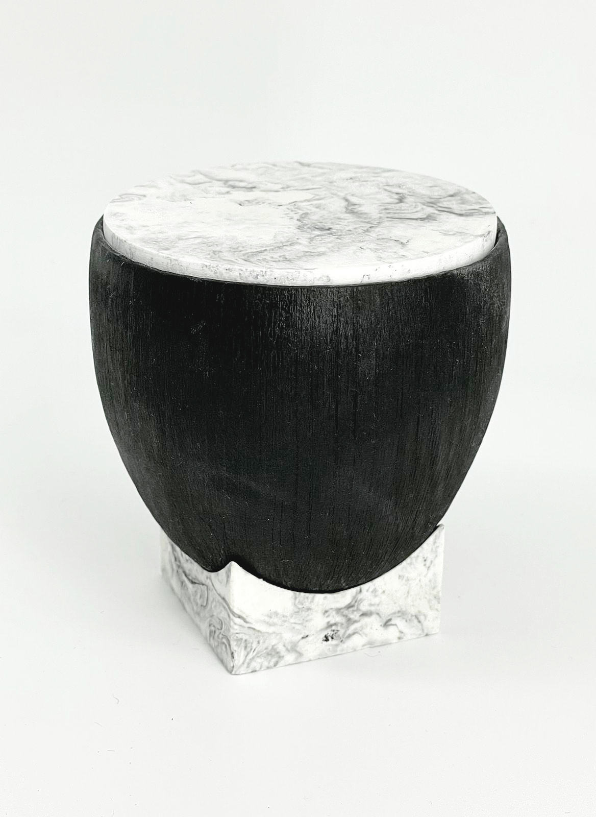
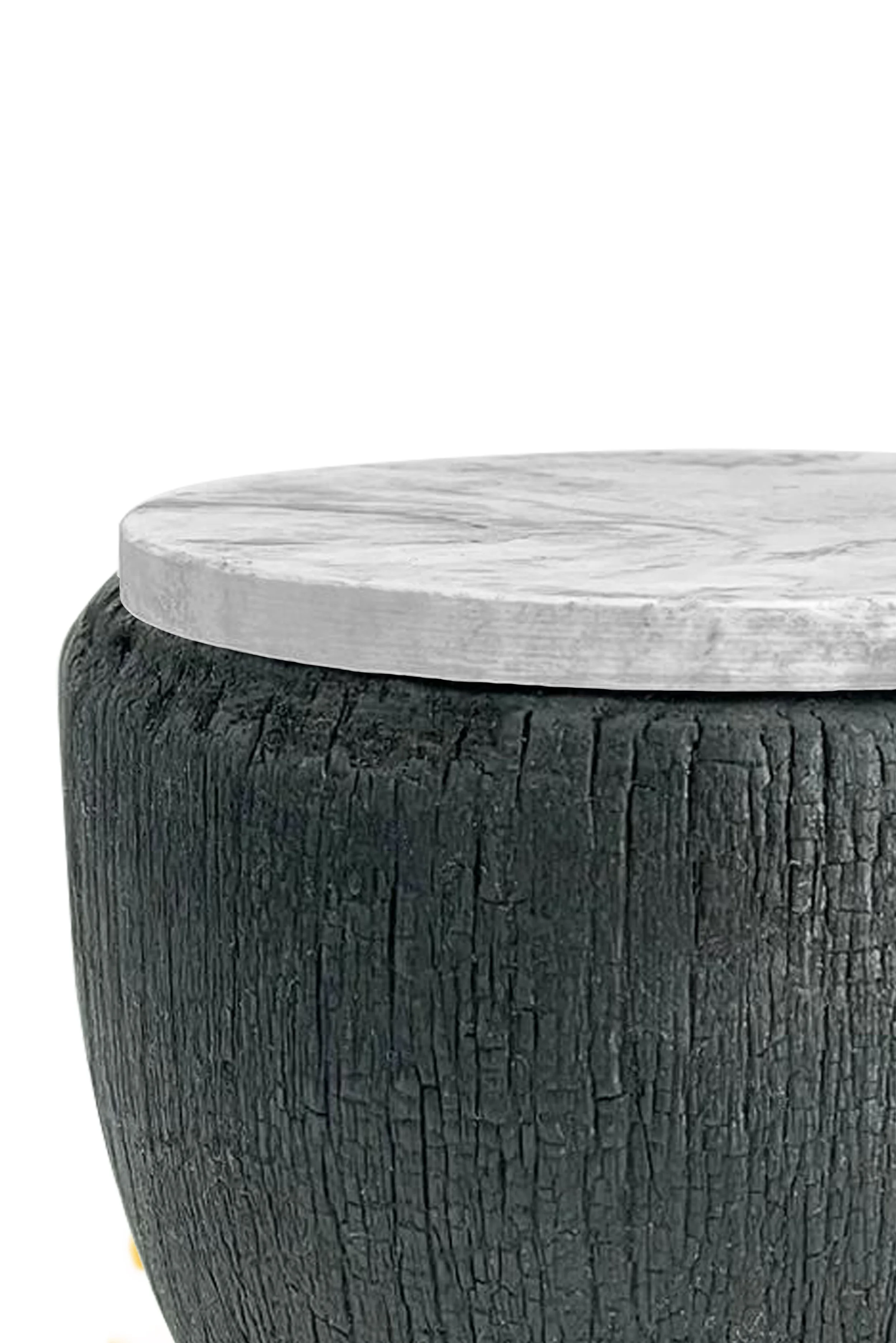
Developed as a collaborative product and CMF study, the table investigates contrasting relationships between charred hardwood, reclaimed crushed marble cast in resin, and Jesmonite.
Rather than treating Colour, Material and Finish as decisions made after the form was established, CMF became part of the product concept itself.
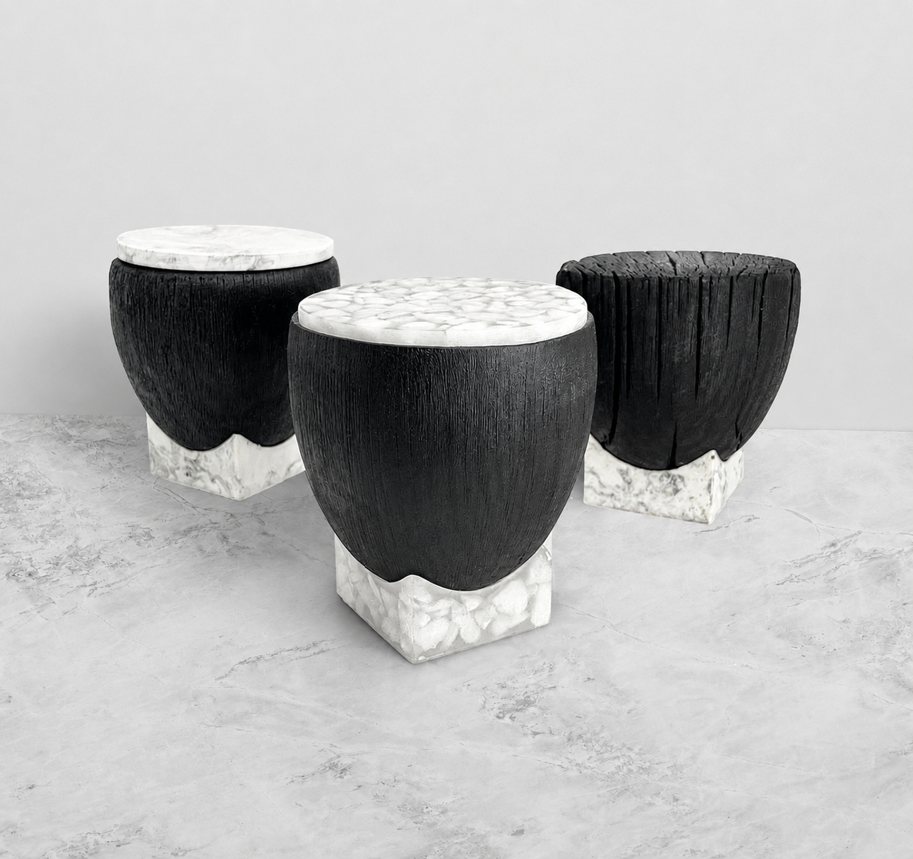
The project resulted in two material expressions built around the same geometry, allowing the emotional, tactile and visual impact of each direction to be compared directly.
The Challenge
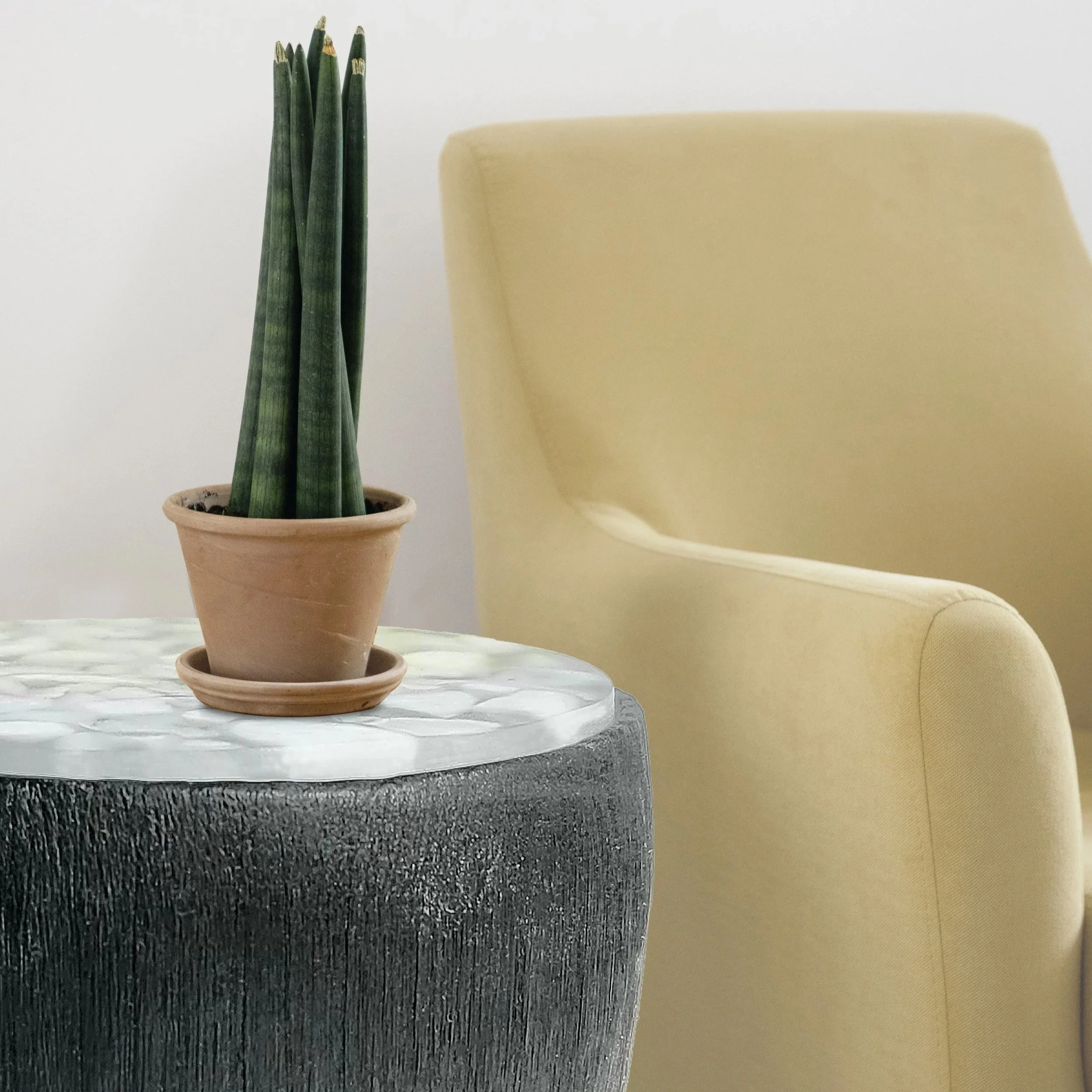
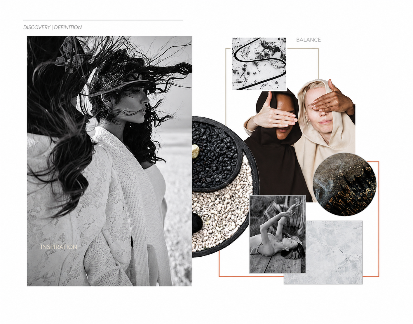
Design a contemporary coffee table that balances material responsibility, durability and emotional appeal, while exploring how reclaimed and cast materials can be integrated into a refined furniture object.
The challenge was not simply to select sustainable materials. It was to understand how differences in texture, temperature, reflectivity, material origin and surface character could influence the way the object is perceived and experienced.
Design Intent
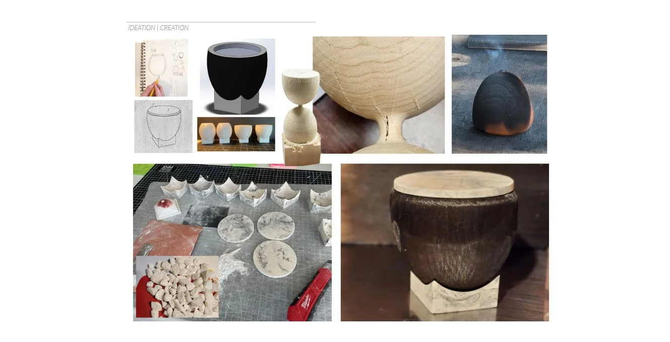
The concept began with contrast. A dark, tactile wood surface creates a strong visual and sensory foundation. Against it, lighter cast materials introduce a distinctly different character.
The same basic form was therefore developed through two CMF directions:
Charred hardwood + reclaimed crushed marble composite and
Charred hardwood + Jesmonite
Keeping the geometry consistent allowed the materials themselves to become the variable. The question became:
How much can the personality of an object change when the form stays the same, but the material relationship changes?
Material Direction 01
Charred Hardwood + Crushed Marble Composite
The first version combines mineral-oil-finished charred hardwood with reclaimed crushed marble cast in resin across the top and lower base.
The contrast creates a more expressive material language:
warm + cool
textured + smooth
organic + mineral
The result feels tactile, luminous and visually layered.
Material Direction 02
Charred Hardwood + Jesmonite
The second version pairs the same charred hardwood with a cast Jesmonite base.
Here, the wood remains visually dominant while the Jesmonite introduces a quieter, controlled mineral surface.
raw + refined
textured + controlled
organic + cast
This direction feels more grounded, restrained and architectural.
CMF Insight
The geometry remains largely unchanged, yet the two material combinations create distinctly different product experiences.
ContrasTABLE demonstrates how colour, material, texture and finish can influence the emotional character of an object before the form itself changes.
Outcome
The project became a study in material contrast, tactile experience and responsible material use — showing how CMF can help define a product rather than simply finish it.
Same form. Different material experience.